Vertical Rhythm
This is a quick introduction into why taking care of your vertical rhythm is highly important for great UI/UX and also dev results on your app or website.

What is vertical rhythm in web design?
Though the term also exists in typography, in web design vertical rhythm is a unified, strict and precise system that defines how spacing and sizing is built on your design.
The idea entails that you pick a base size and use its multiples in ever aspect of your design. Usually 4px as a base is the best choice. This means your smallest margin is 4px, and all other margins are multiples of 4.
For example the only spacing you use in your design is: 4px, 8px, 12px, 16px, 20px, 24px .... 96px ...

Extend this to horizontal spacing
and font sizes, margins, padding, sizes of thumbnails, etc ... even your entire grid.
Using this system removes a layer of decision making. You don't need to move pixel by pixel to make things look right. You don't need to know the value of the space in pixels. The smallest spacing (4px) can be called 1, double that will be 2 and so on.
You'll quickly notice that if a level 2 spacing doesn't look right, you bump it to the next level, level 3 which is 12px. This limitation or restraint creates a LEGO block effect where everything fits with everything else. You will gain confidence because things will just start "snapping" together
Vertical rhythm refers to the consistent spacing between elements on a page. This can include the spacing between paragraphs, headings, and images. By maintaining a consistent spacing, it becomes easier for the user to scan the content and find what they are looking for.
Horizontal rhythm, on the other hand, refers to the consistent alignment of elements on a page. This can include aligning text to a grid, using consistent margins and padding, and aligning elements such as buttons and images.
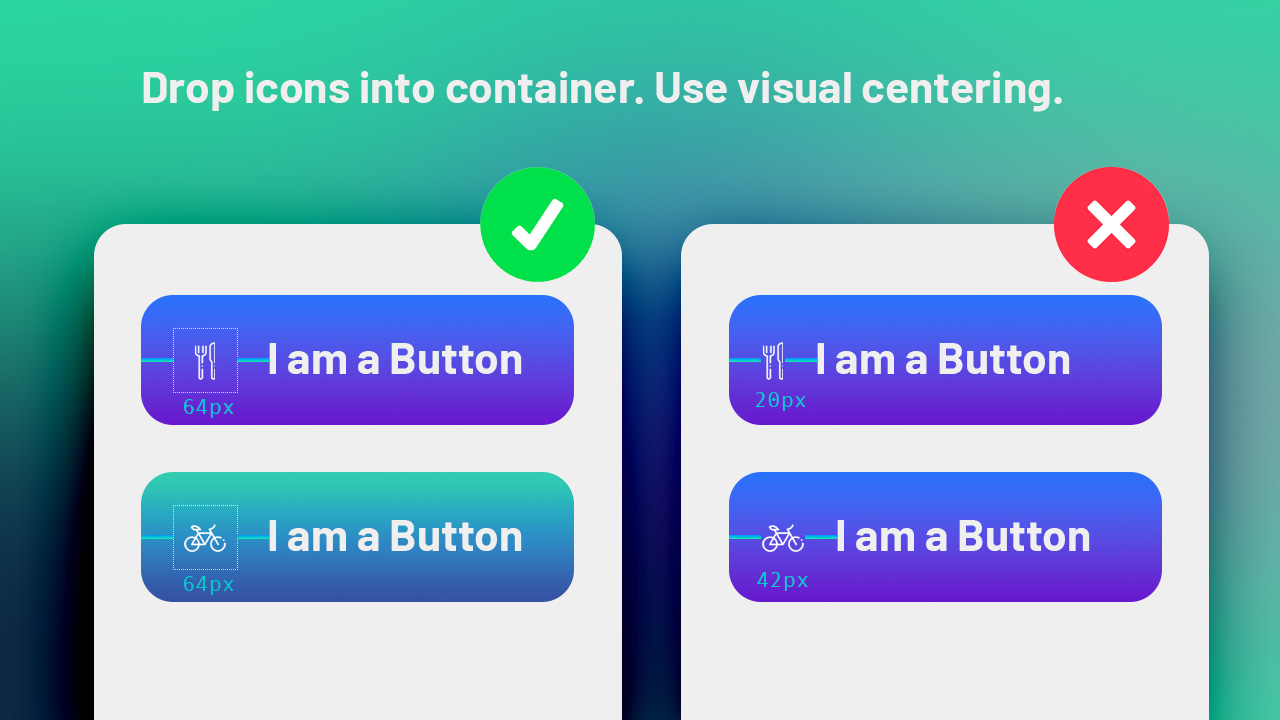
Keep your icons in a container
Icons vary in size. Some can be wide some can be narrow. In order to keep everything aligned and visually pleasing remember to keep all of your icons in a "box". The box should adhere to the rhythm of your website and be visually centered in the middle of this box

Wait, what is visually centered?
Sometimes when you perfectly center an icon in a frame or box it just doesn't look right. The most common problem is with a triangle inside a box or circle. This happens to any icon that visually heavy to one side.
Notice in the example that the triangle seems off, even though its perfectly centered. To solve this all you need to do is nudge the icon towards the less weighing side to offset this issue. Another win for rhythm in your design and boxing your icons. Designers often call this technique optical centering.
"Your first steps into building a design system"
Sure you'd think graphics design is just an artistic feeling and you need no rules.
But in reality the quicker you learn to use a system, and stick to it, the quicker you'll notice that your designs will start making themselves. You'll need to input a lot less effort into them. Furthermore these designs need to be coded, and to save development time and stop programmers from reading every single spacing you should adopt vertical rhythm in your designs. It makes life easier, and usually you can guess the correct level of spacing instead of precisely measuring the distance.
Entire CSS frameworks like tailwindcss come build in with a 4px spacing system which makes translating a static design into a working website a pleasure not a chore. One of the key principles of Tailwind is the "4px rule," which means that all spacing and sizing should be based on multiples of 4 pixels. This makes it easier to create a consistent vertical rhythm and ensure that elements are properly aligned.
Overall, using vertical and horizontal rhythm is an important aspect of UX design. By creating a consistent and balanced layout, designers can help make their interfaces more intuitive and user-friendly. Frameworks like Tailwind can help make it easier to implement these principles and create interfaces that look great and work well.
This is one of my quickies about UX. Come back next time to see more.