
There are 16 million colors
and this is why you shouldn't be using the base ones. Using pure black (#000000) or pure white (#FFFFFF) in your web designs might have a negative effect on your users experience.
The problem of fatigue
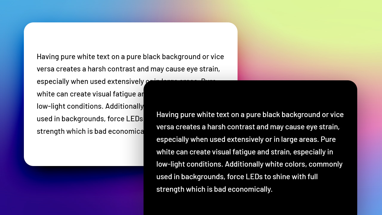
Having pure white text on a pure black background or vice versa creates a harsh contrast and may cause eye strain, especially when used extensively or in large areas. Pure white can create visual fatigue and strain, especially in low-light conditions. Additionally white colors, commonly used in backgrounds, force LEDs to shine with full strength which is bad economically.
The recent trend in dark mode versions only supports this further.
The problem of contrast
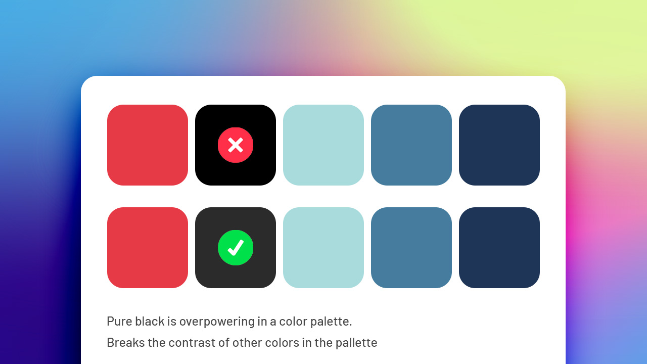
Pure black may not be recommended is that it can appear too stark and lack depth, especially when used in conjunction with other colors or imagery. By using softer shades of black, designers can create a more balanced and nuanced visual experience.
How to solve this?
Just don't use them.
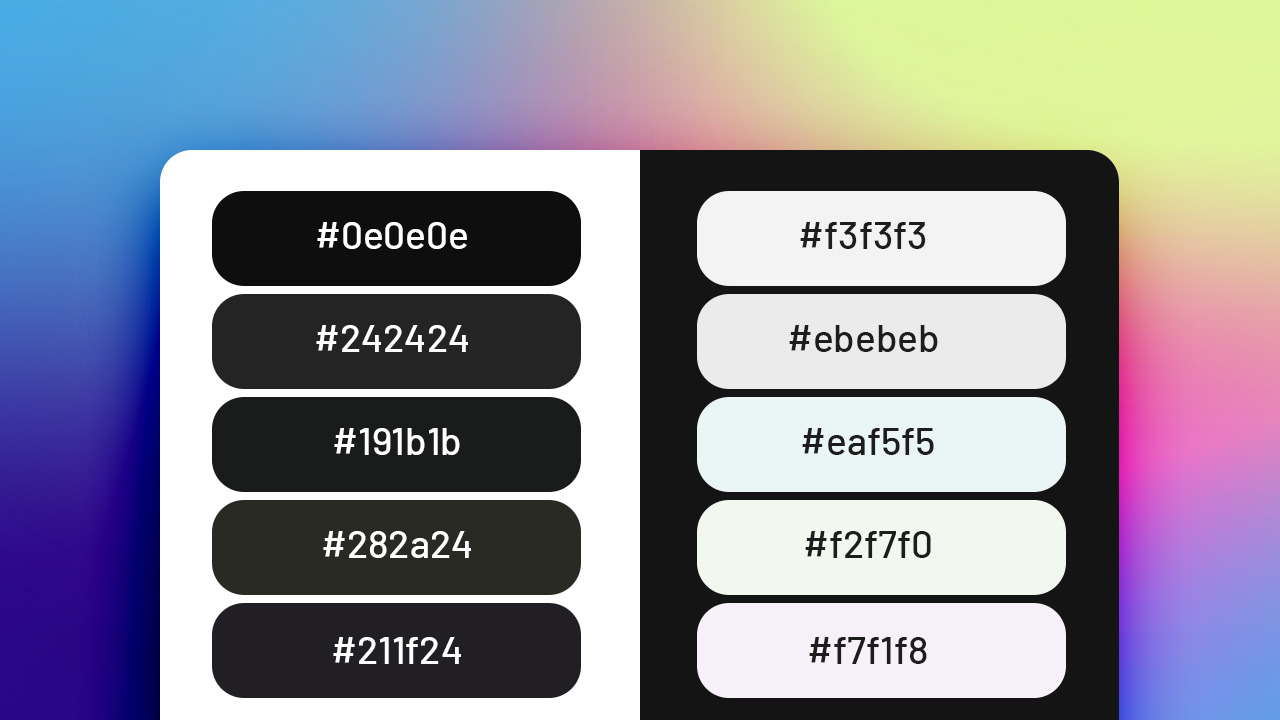
You can use a slightly lighter tone of black, or a slightly off-white and you'll be on your way.
Alternatively you can also tint your darks and lights with a color. In the example you can see a really deep bottle green and a deep space purple. Or a really light blue as an alternative to pure white.
See what works best with your design. Do you want to learn more about UX? Take a look at my glossary