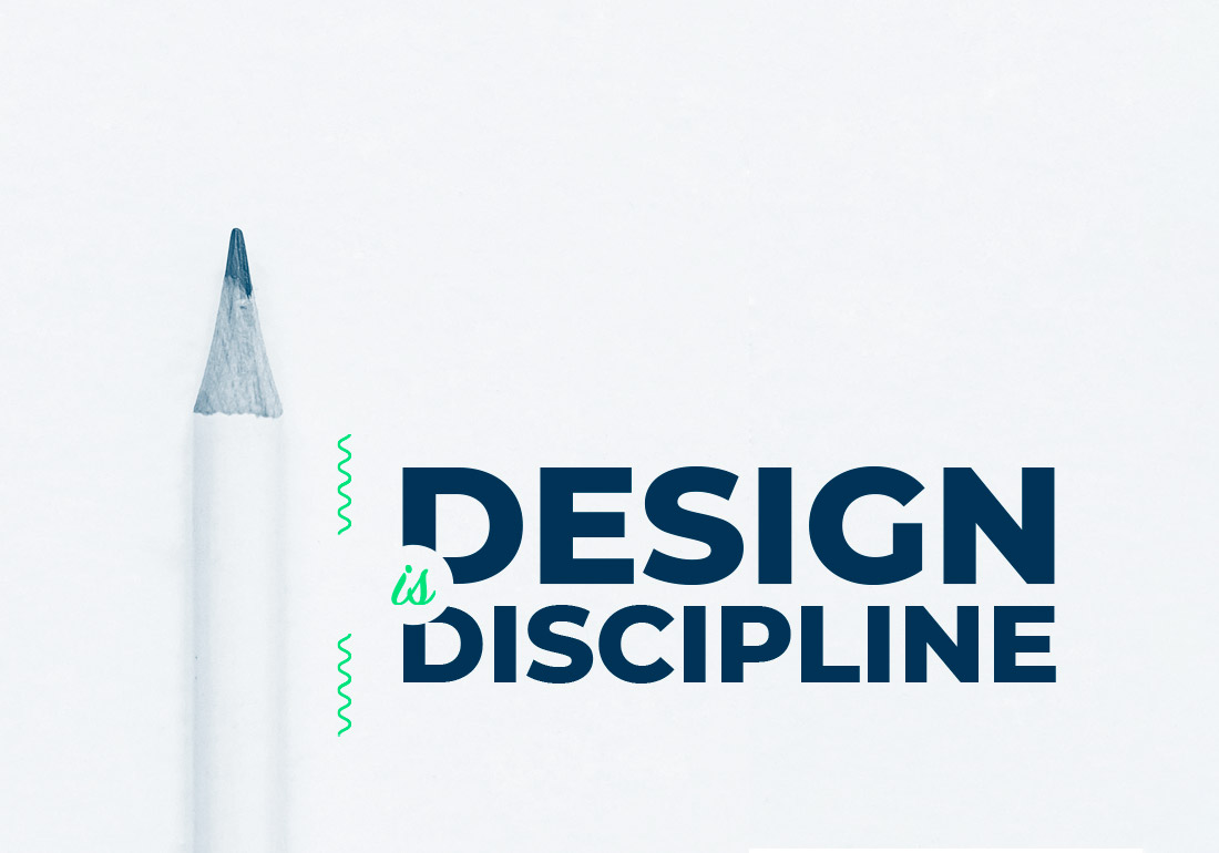
Design is Discipline
So you are an artist? You want to do UX or UI design? You think that having that "creative feeling" and "good taste" for aesthetics is all you need?
Wrong ...
10 years of experience has taught me one thing.
I was once in your shoes, took everything by hunch or feeling. But if there is one thing you should get out of your system it's that good design is not based on feeling, it's cold, harsh and calculated.
You have to quickly learn the difference between 'art' and 'design'.
Art can be interpreted, Design is communicated
Think of the your favorite, well-known logo, or branding, or design style. I'm pretty sure that design uses strict discipline, uniformity and consistency. The sooner you let go of your urges to freestyle something, the sooner you will learn how to make truly timeless and rememberable designs
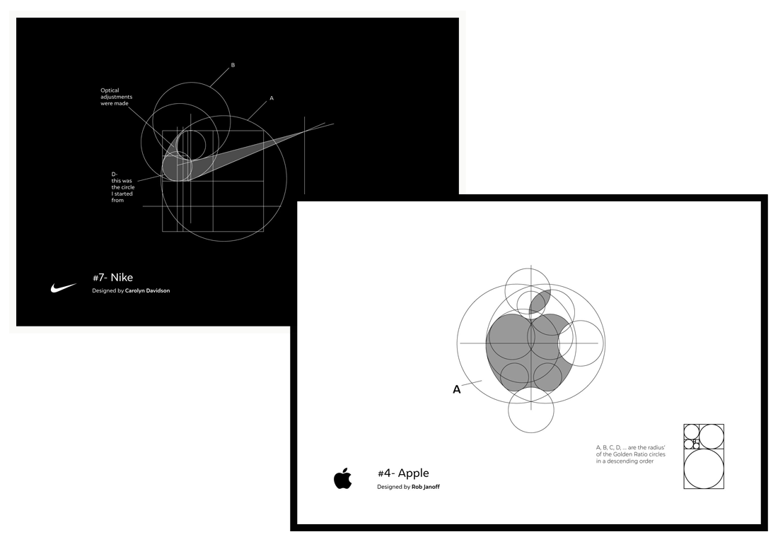
Florian Popescu - Famous Logo Grids
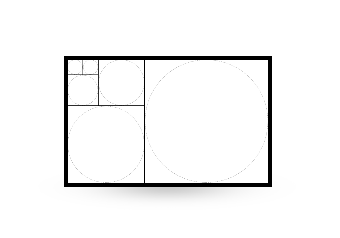
#1 :: Use the Fibonacci Sequence
Once you have selected your best hand-drawn sketch, and are ready to transfer it to a digital format, the first thing you should do is create a set of guidelines for your design. Using the Fibonacci sequence for this is almost a no-brainer.
To create a grid choose a starting point, for example 1cm or 4px. Now apply the sequence to create the rest of the sizes you are allowed to use. 4px, 8px, 12px, 20px, 32px, 52px etc etc ...
Now you may proceed in building your design. Be strict, be uniform, be consistent.
Stay within the confines of the grid you created, though sometimes you can allowed deviate from it. If you have a design you already did freestyle, try to recreate it with a Fibonacci grid. Compare the results, you might find the structured and disciplined version to be more appealing.
#2 :: Use vertical rhythm
Remember that grid you made using Fibonacci? Yeah, use the same methodology in your top & bottom spacing.
In vertical rhythm, use multiples of one of the sizes you made. For example, if you start vertical rhythm from 4px, then the next spacing size you can use is 8px, then 12px, 16px, 20px, 24px, 28px etc etc...
If you stick to your vertical rhythm with discipline and uniformity you will succeed in creating a good flow in your design. No more guessing what space your should use, just pick one from the list you made.
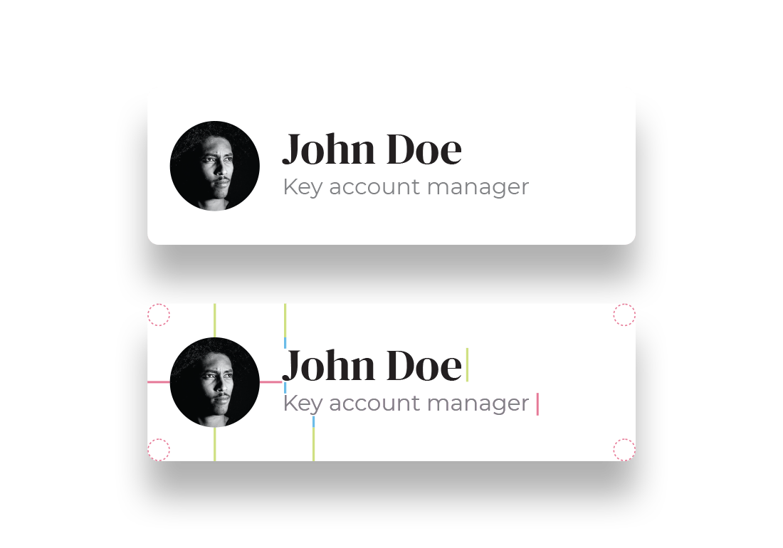
"Just sticking to a grid goes a long way"
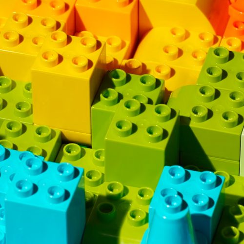
Notice in the example above, that just sticking to a grid goes a long way. Picture your design as a set of Lego bricks. You have a limited amount of sizes and your task is to build your components out of it. The example uses a 10px size (blue) seen in the spacing between the text. A 20px size (pink) between the horizontal spacing of the avatar, the radius of corners and even the font size is set to this size. The green guides (30px) show the vertical spacing and the size of the main text, whilst the avatar is 80x80 utilising the Fibonacci sequence.
There is no more guessing in a system like this. You know exactly what the next or previous spacing amount should be, so if you require more whitespace you just jump to the next size. The worst you can do for yourself is use freestyle / random values like 17px from the top and 23px from the bottom. Sooner or later shortcuts like this will lead to non-unified views, and you will notice something is not quite right with your design, but you won't know what.
Know your colors!
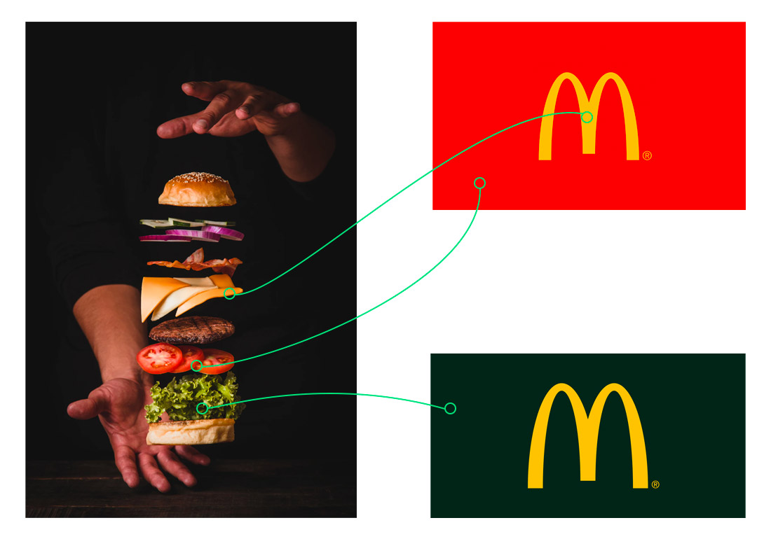
Every color conveys a message, a feeling or a distinction... use this to your advantage. For brands that should feel reassuring or calming you should opt for blues and greens.
For a hip, fast and youthful look you need to pick oranges, yellow and reds. Want to impose elegance and trustworthiness? Try black with gold or a legal brown. Choosing a color palette shouldn't be a lottery. Research your brand, know what they are selling, know the target market and then choosing a color is calculated and poised at success.
Notice how changing colors from a fast-food red and cheap yellow, to an elegant deep bottle green and gold makes you think this brand changed its outlook, is now destined for eco and bio friendly meals, including never before dreamed of artisan menu items.
#3 :: Create a color palette
Users subconsciously make judgements about a design, in which 62% - 90% base it on color alone. The first couple seconds of being presented with a brand is most probably a lasting impression they'll have. Make your first impression count.
Logo Colors by webfx
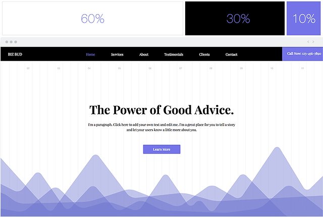
60% / 30% / 10% rule. When creating a UI (web or app) or when creating print, or even in your home when you renovate, use discipline and uniformity. The 60% / 30% / 10% will help you get the right proportions of colors on your project. 60% is going to be your main color. Usually this will be the white background and light greys you use on your web design or when you paint the walls of your house.
30% is for a domiant helper color. This is a complimentary color to your accent color. This will be used in navigations or as curtains in your home.
The 10% that is left, is for your accent color, the one that is meant to pop. Its the "Call to Action" buttons on your website or app, its the single most attractive thing you have on your site. It's that burning red pillow in the middle of your white and beige bed. This color should attract the user and is used the least, but in the most important situations, like buttons or headlines that really need to be noticed. Never overuse this color, it will loose its potential.