AI Case study - Editorial image
Recently, I had the opportunity to delve into the world of creating an editorial-style whitepaper for Amsterdam Standard. Inspired by magazines like Times and Newsweek, I aimed to incorporate the characteristic illustrations that can be found in such publications. The whitepaper was on comparing employment costs between countries and the pros and cons of hiring in-house developers versus remote ones.
This case study showcases how Midjourney helped me bring the document to life, and what I learnt trying to get consistent images for each of the chapters.
Turns out getting a consistent style can be achieved, although it took a while to get to the perfect prompting system. As soon as the PDF becomes public I'll share a link to download.
Crafting the direction.
I didn't want this new document to be in the core branding style of Amsterdam Standard. I knew I wanted a pastel palette and one of the colors had to be orange. The PDF will ultimately land in the hands of people from the Netherlands so going orange would feel right at home.
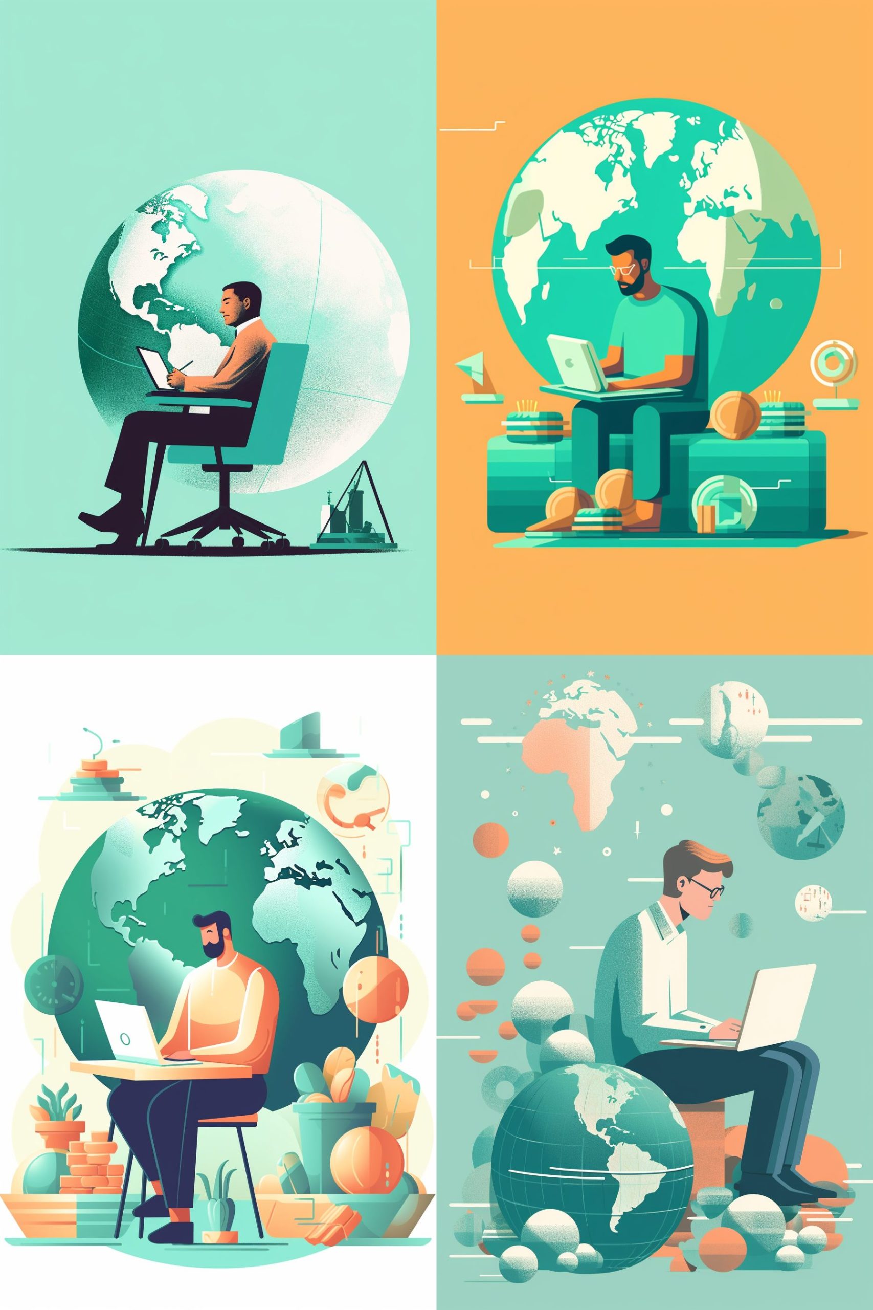
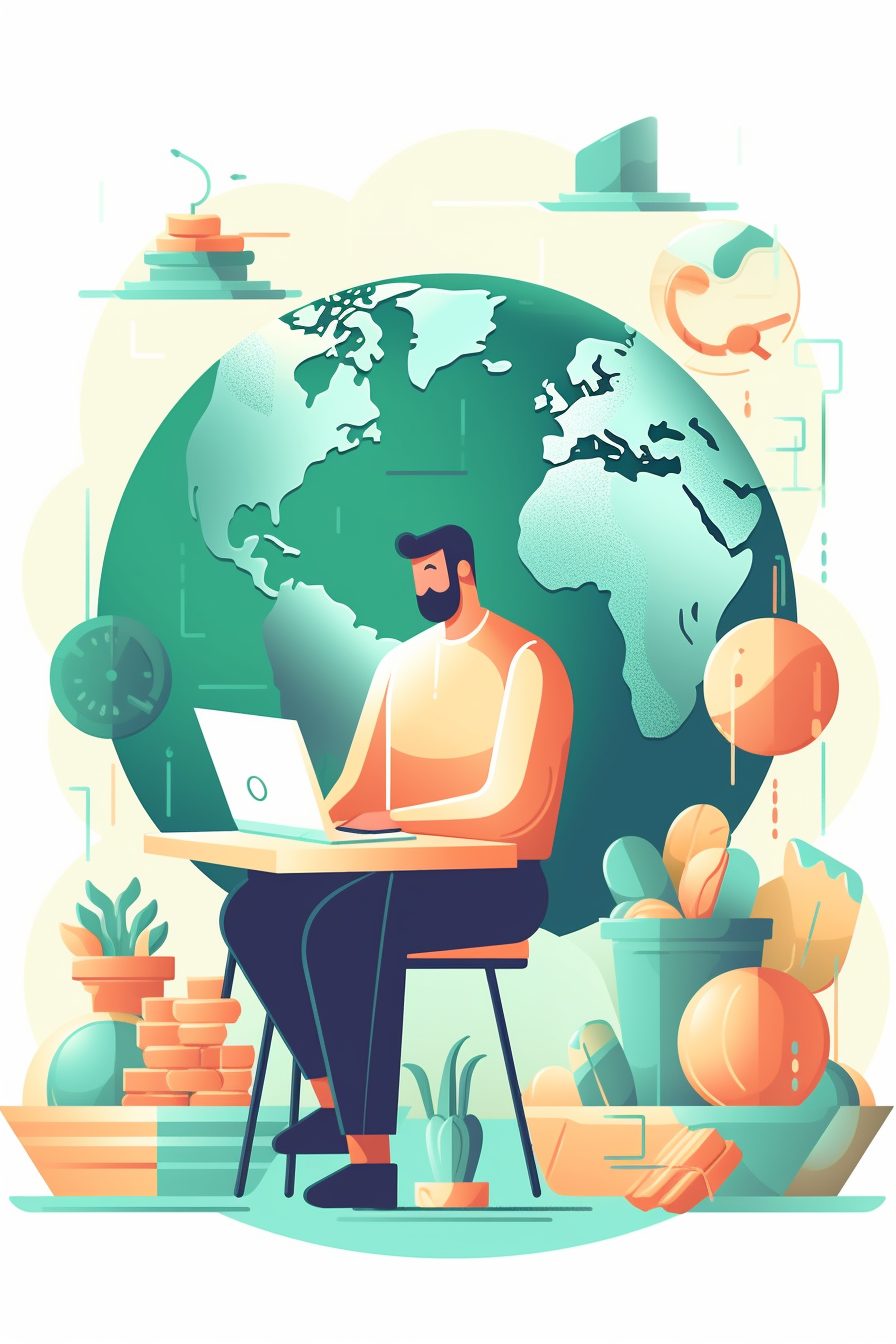
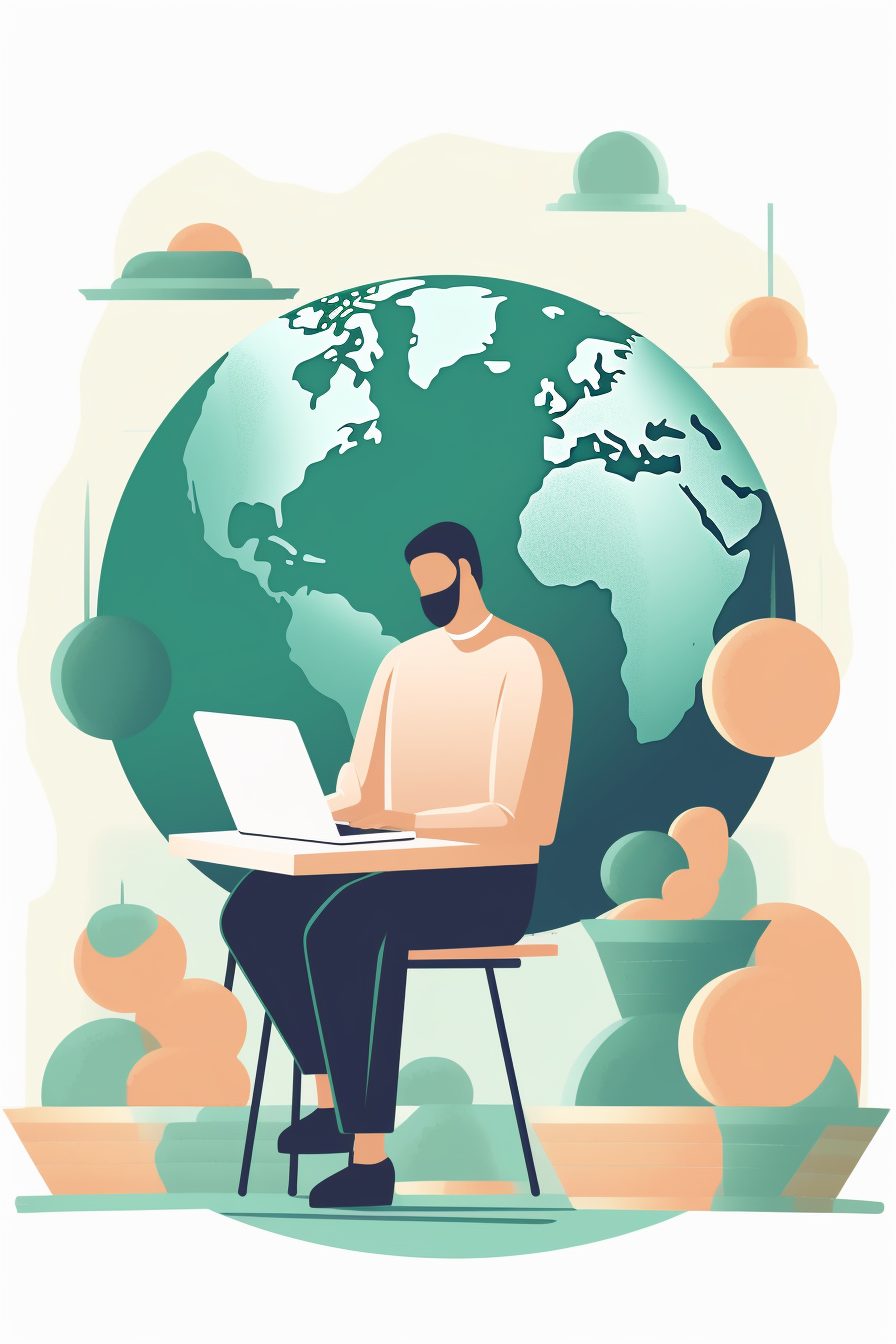
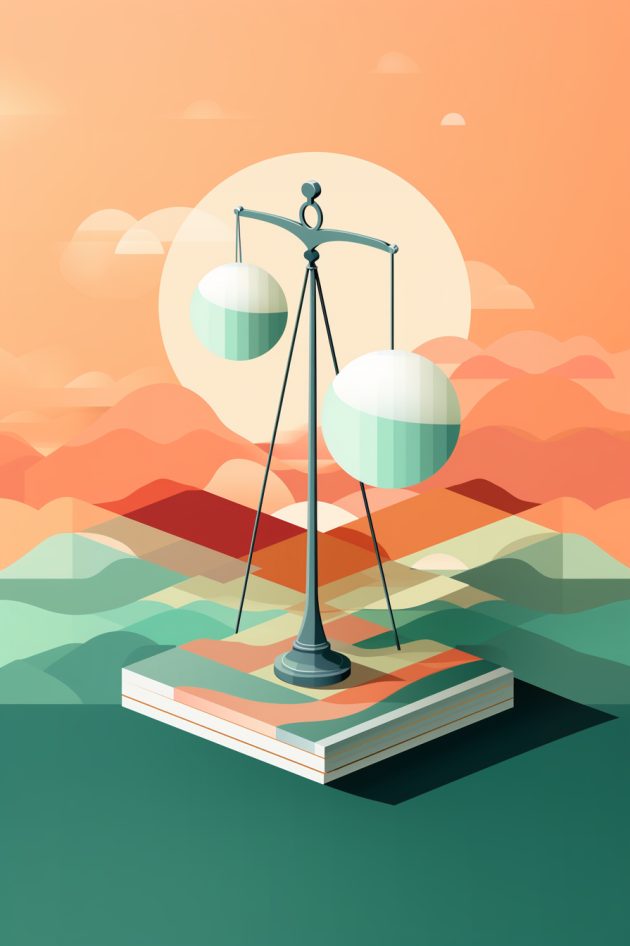
I didn't really know where I wanted to go, so I started with basic prompts for editorial illustrations. The first thing I learned is that the aspect ratio of the image also impacts the end result. When I used the default 1:1 I wasn't getting satisfactory results. Simply changing the aspect ratio to one of an editorial, 2:3 was enough to start getting pastel colored, light illustrations that matched a magazine look.
I liked the guy at his laptop and expanded on that prompt, making it more about the world, and money. The bottom left was a great image, but I wanted it simpler, and so I started with the bottom right image as the header to my document.
/imagine an editorial illustration ,minimalistic style, pastel mint colors, globe on europe, coins and a man sitting at his laptop --ar 2:3 --s 400 --c 10 --style raw
Ok, now what? I need more of these images.
I took the image, placed it into Photoshop and edited what I needed, changing the blank circles into euros.
And then it dawned on me ... I will need a whole series of these images! How on earth will Midjourney understand and make them all in one style and color.
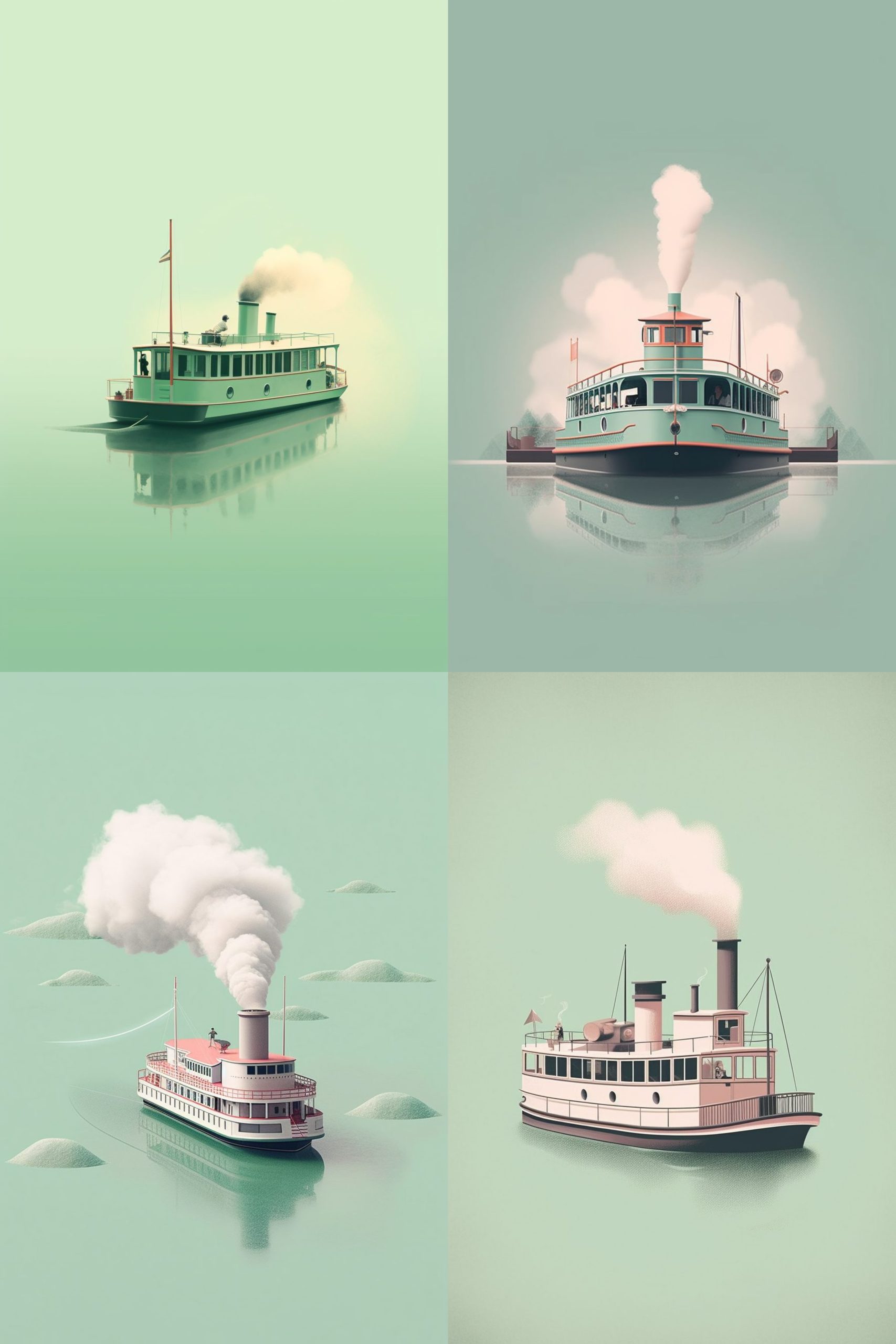
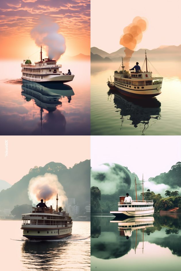
I wanted a steamboat in the same style as the image above, so I thought just making a variation and replacing the words would work:
an editorial illustration ,minimalistic style, pastel mint colors, a small steam boat --ar 2:3 --s 400 --c 10
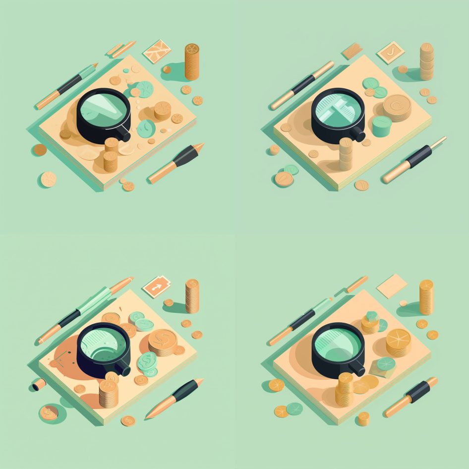
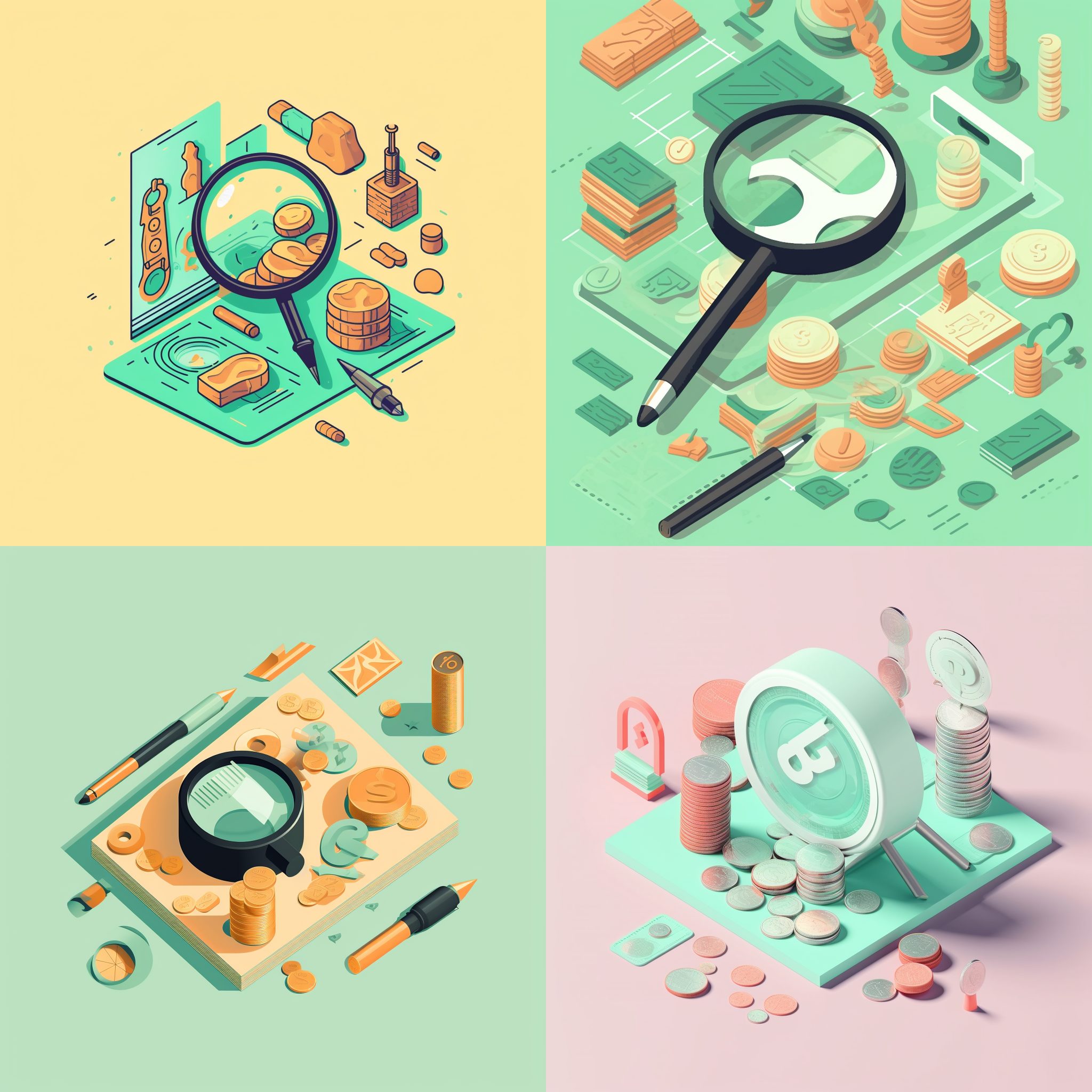
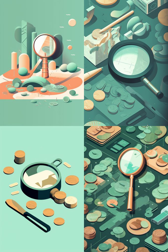
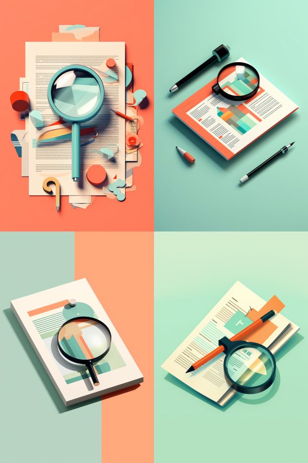
Yeah ... the steamboats are completely not what I want. I tried using the --seed parameter to start from the same spot, and switched to magnifying glasses. All Midjourney would need to do is change the subject. But no :( a magnifying glass seems to be an abstract concept for AI.
The magnifying glass was much closer to what I wanted. I was starting to home in to a similar style. With sweat accumulating on my forehead, knowing that if AI won't be able to do this I'd have to get my iPad and Pencil and draw the rest of the images. Yikes ... wait ... what? My work was exactly like that before the rise of AI. Now grabbing a pencil is a chore? How did I get to this state?
AI! Why won't you listen?
That was my constant internal scream.
Then I remembered that Midjourney is like a junior intern just came to the company, and you need to explain everything, which is super hard if you are deep into the context of a project. Just because I see the design in my head, and know exactly what I want, distilling my ideas into words and using the right keywords was what AI needed of me.
I started experimenting with simpler terms, just describing what I want. After a couple trial and errors, I finally got the result I was looking for. I was happy Midjourney kept using the same color palette, making my job easier.
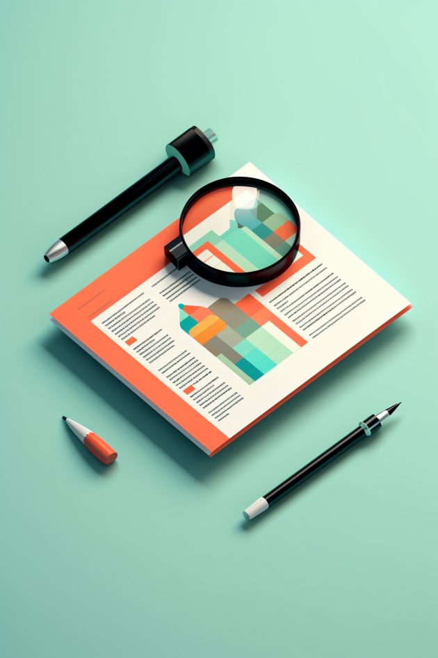
The bottom right image was finally used in the next chapter of the whitepaper.
an editorial illustration ,minimalistic style, pastel mint and orange colors, magnifying glass on invoice --ar 2:3 --c 10 --s 400 --seed 4110768048 --style raw
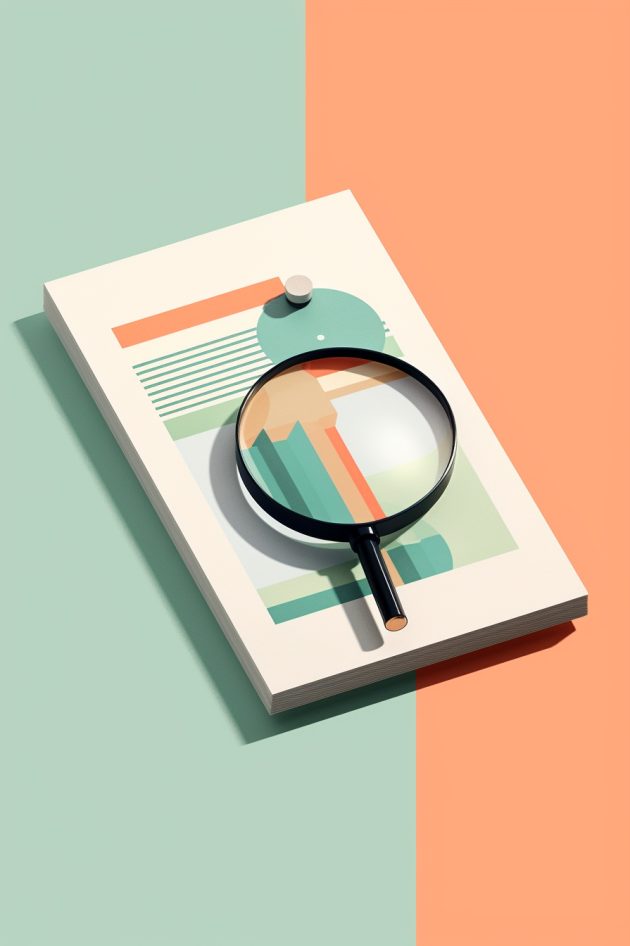
I took the magnifying glass on an invoice and cut it out in Photoshop and imported it into InDesign. Thats when I decided to try and fuse --seed, image reference and the entire prompt ...
The "in the style of" revolution.
The game changer was creating a prompt which included the reference image (the above magnifying glass) and wording it as "in the style of".
In most tutorials and Youtube videos they only mention adding the reference image in front. I put mine at the end, and that was the secret trick to getting similar images, quickly and easily, sometimes with just one prompt update.
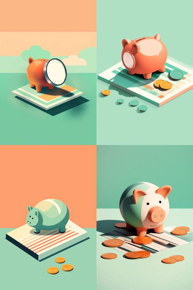
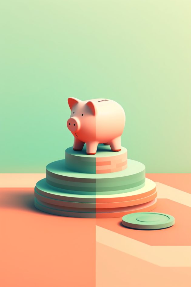
an editorial illustration ,minimalistic style, pastel mint and orange colors, piggy bank with coins standing on 3 level podium , side view, in the style of [reference url here] --iw 0.7 --ar 2:3 --c 10 --s 400
After a couple variations and prompt tweaks I got a piggy bank that looked good and in the same style/color of the rest of the paper.
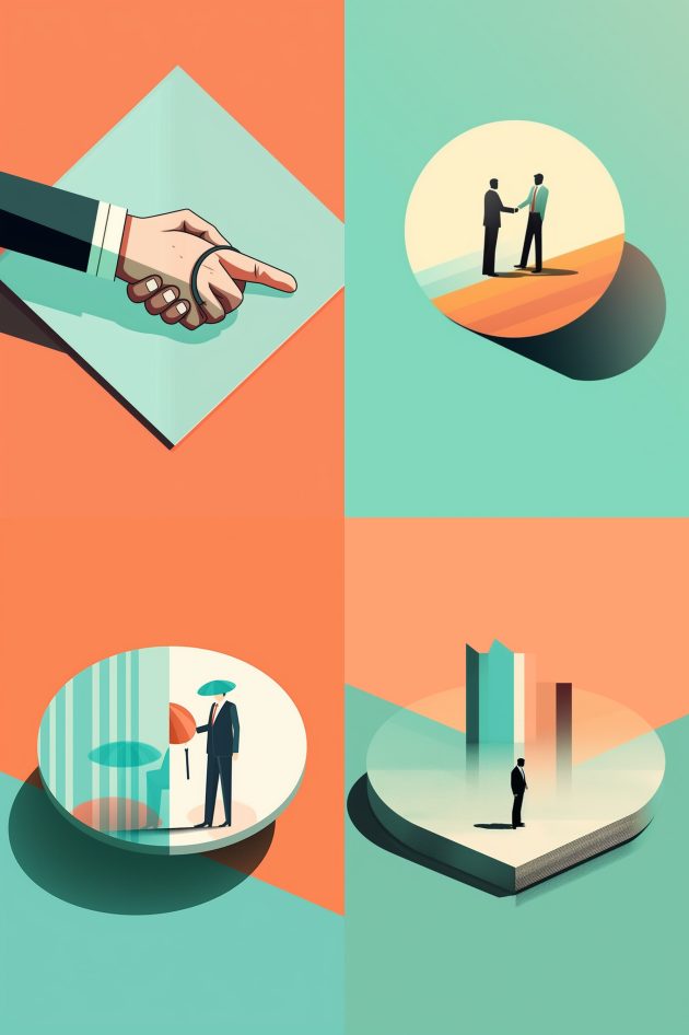
an editorial illustration ,minimalistic style, pastel mint and orange colors, business handshake , side view, in the style of [reference url here] --iw 0.7 --ar 2:3 --c 10 --s 400
Hands, and actions dealing with hands are still an issue, but still, the style is consistent.
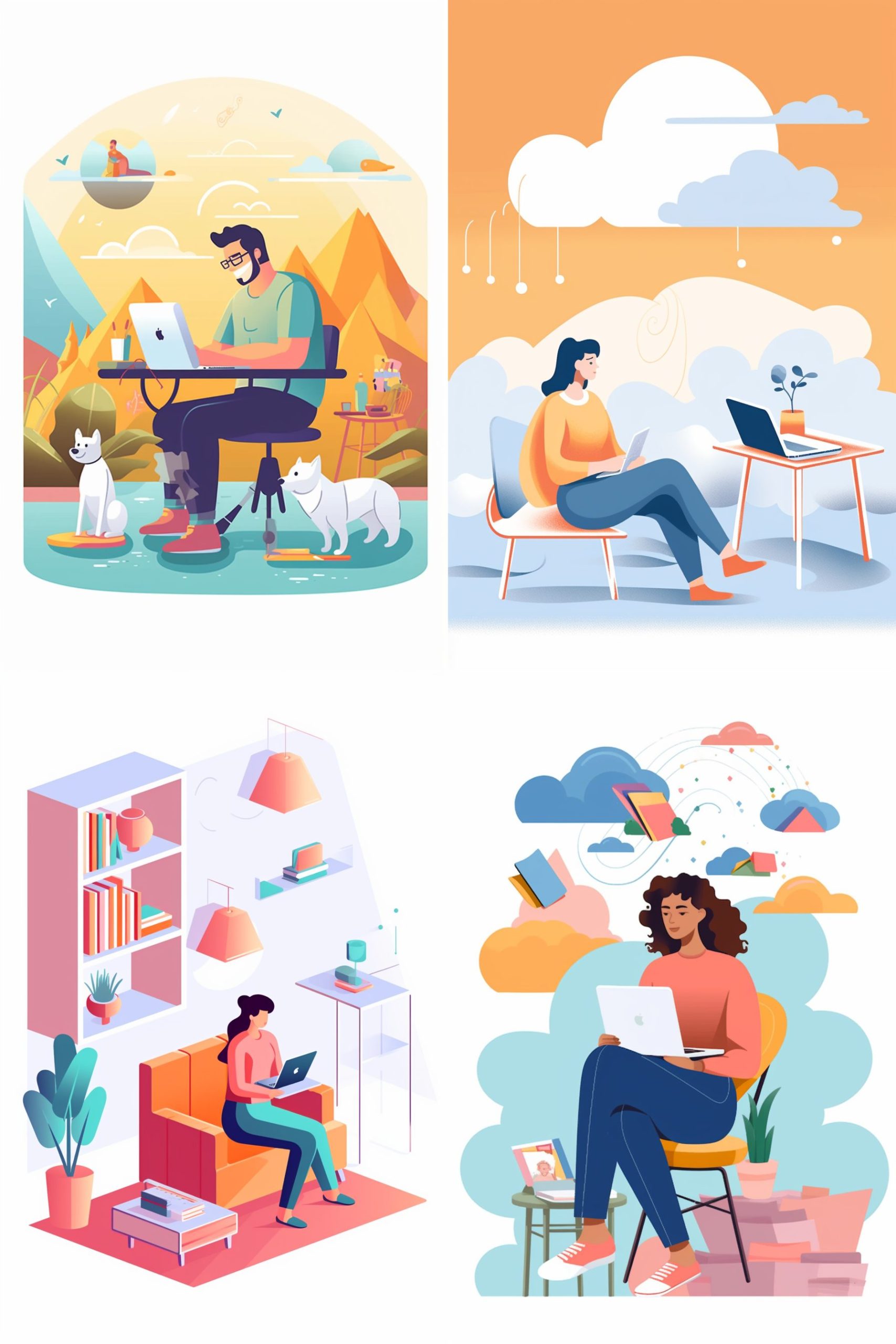
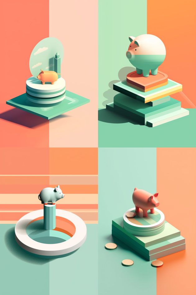
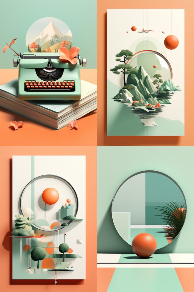
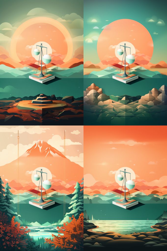
With the secret unlocked I just went and asked for all the subjects and scenes that I could have needed for the whitepaper. The following are some of the better results:
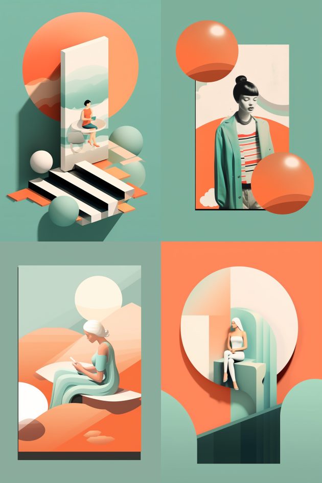
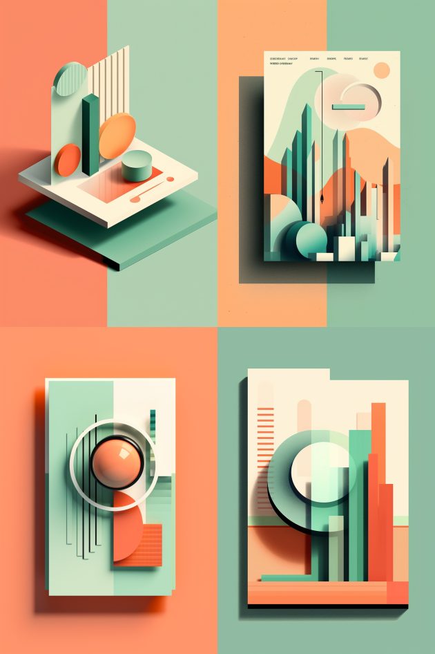
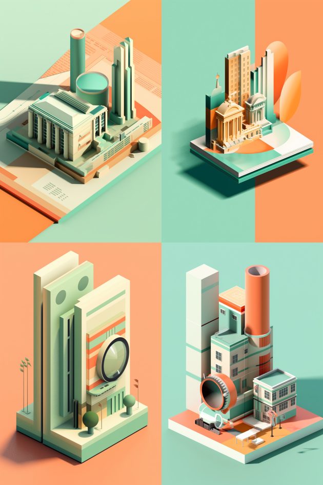
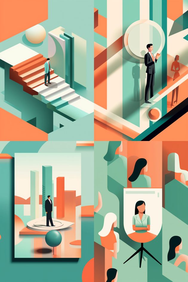
"I was able to generate a whole set of interesting images, all in the same style."
Riding the wave of making consistent Midjourney results, I generated all the assets I needed for the paper I was making. I had to slightly alter some images in Photoshop, tweak colors, or use some assets from previous generations to make it all come together.
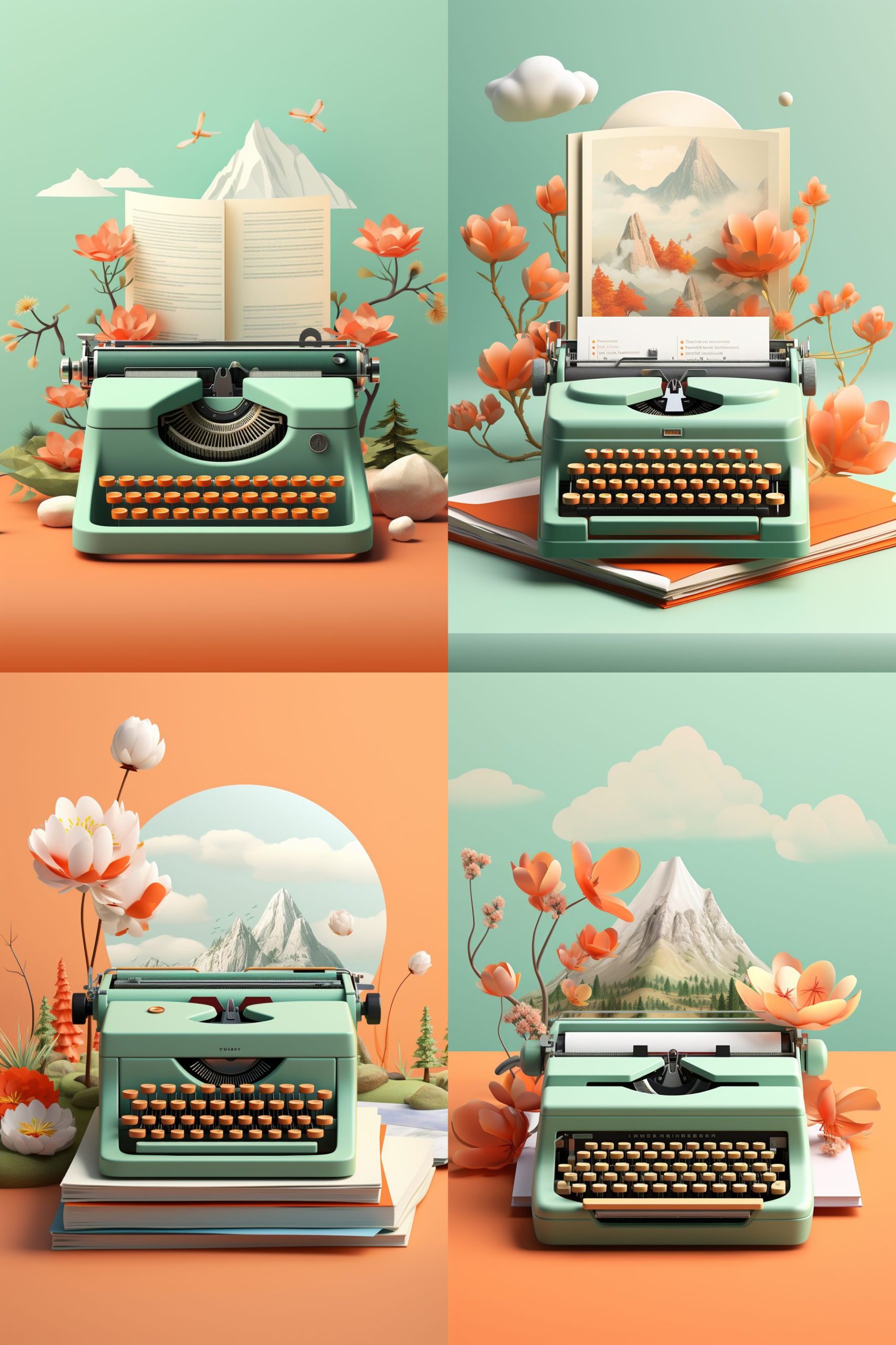
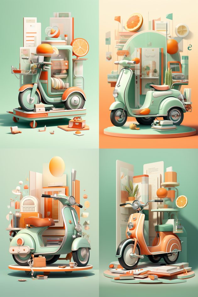
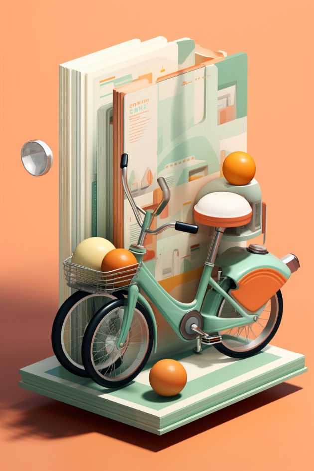
In some cases the AI decided to jump a bit too deep and go really complex, or too far into the 3D space: the scooter or typewriter. Those images are really pleasing, and look great, but they don't fit the flat style of the other images I was using. Oh by the way you can download all the images from this article: Download them here
Out of the blue, Midjourney 5.2
I was going to end my article here, but while working on the final pages of the whitepaper, Midjourney deployed version 5.2.
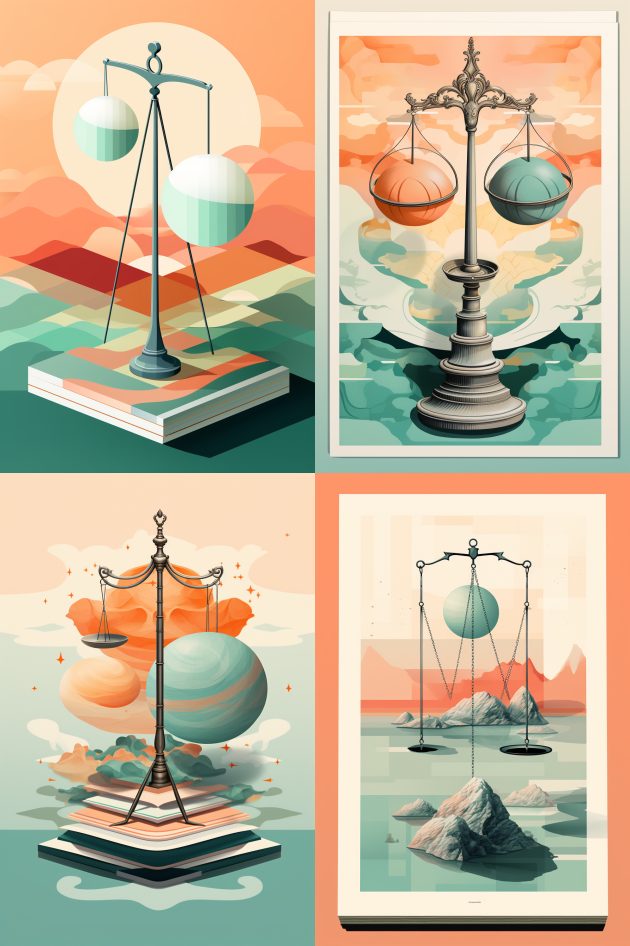
And that changed a few things for me. The latest model (5.2) is even more realistic, even more sharp and precise. When prompting for more editorial images I received a lot more of the very smooth 3D images. I had to tweak the prompts a bit, and sometimes used the --raw option to better represent the illustrations I needed.
But Midjourney added a huge functionality! At least for me, as this is something I had to go back and forth on in Photoshop to achieve. The zoom out button. You can now click a button, and Midjourney will keep the exact same image and add a bit more in the background. Wow. It does go a bit crazy as seen in the second image, but most of the time it zooms out just enough so its easy to cut out, or just use out the box.
Thank you for reading, if you like to read some more about AI, check the links below.