Pushing Corners - 3D effect in CSS
Let me show you how to quickly create a "3D" effect when hovering over a card in CSS. When your cursor in any of the 4 corners the card will look as if pressed in on that side of the card.
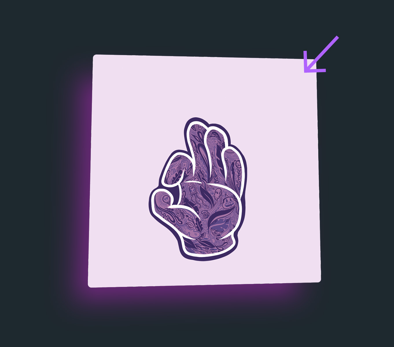
What we'll be building today
As seen on the video, I'd like to show you how to make this 3D effect on hover of a card. This can be achieved in a couple of ways, but I'll show you what I consider the easiest way to tackle this. I will use mostly css, the bulk of the work will be here while javascript will be just for changing a className to trigger the effect.
#1 The Basics - CSS
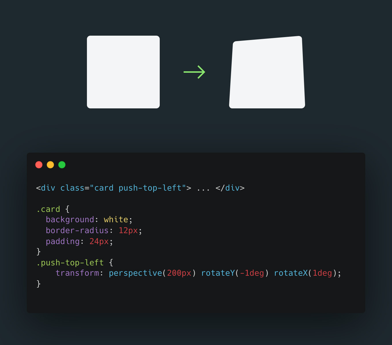
To achieve this effect we must know the basics of css, specifically the transform property that allows to create vector effects with our html elements.
Amongst other properties we'll find Perspective and Rotate X & Y
Perspective will allow distorting the element and using rotateX and rotateY changes the x and y axis creating the pushed in 3D effect. Increasing the degree in the rotate setting will increase the depth of the effect.
#2 Tricking the system
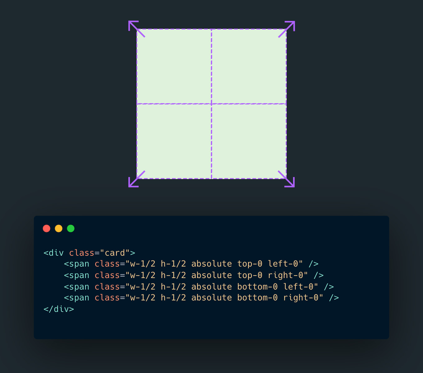
Since we now know how to push down one of the corners, we might be encouraged to apply this effect for every point on our card. yes, that would make a realistic effect, making the card move exactly where the cursor is, but at the same time do you need to be that precise? This isn't a core feature, save performance for something more important.
You can get away with a compelling effect by just making 4 hoverable areas: [top-left, top-right, bottom-left and bottom-right]. Hovering anywhere on one of these 4 triggers will trigger the animation. I add 4 spans into the div and position them absolutely in each corner. Remember to set the card to position:relative
Seen here is tailwind.css, if you haven't yet witnessed its power please do so!
#3 Where Javascript needs to help us
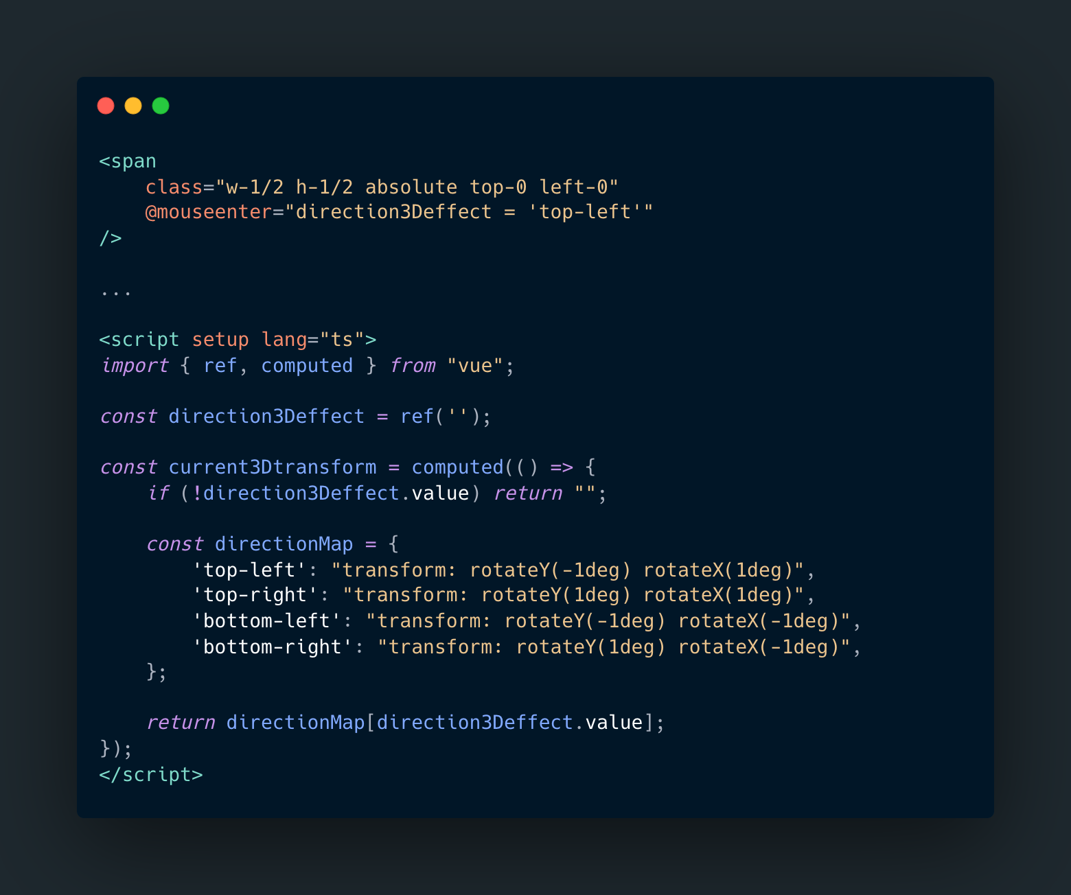
All that's left to do is when you hover on the each respective span it should change the parents div, rotateX and rotateY values to push the corner. It's 2023 and we still can't select parents in css, so we'll need a simple js function that will switch the classes when we hover on a specific trigger.
In the example I'm using vue.js but the key concept can be used in any framework (vanilla included).
When you hover on any of the spans it should trigger a function that changes the rotateX and Y values. I opted for changing this via the "style" attribute, but you can also have 4 dedicated classes and rotate between them.
Finally, you will want to animate this effect for it to actually look nice. To do so implement transition in the css class for the parent box.
"Known issues & Final Notes"
Some key things to keep in mind.
Since the invisible spans are absolutely placed above your card content it means you wont be able to interact or select text in your card. A link, for example, can be placed outside the card instead of in it. So this effect is rather for images or elements that don't need interaction.
The transform properties are relative to their size. That means that a 1 degree change on a small card will be minute, while the same 1 degree rotation on a large card will be very pronounced. Tweak the degrees depending on the size of your elements.
If you are planning to use this on a large scale (like a gallery) think about performance and removing event listeners
Is a fully css version possible? Most probably but I think there would be a lot of DOM elements at play, so I assume using js to toggle a class is a lot easier to use and read in the future.